portfolio
Home Staging / Residential-Renovation / Commercial
Photo Gallery - home staging
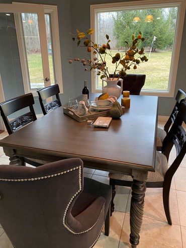
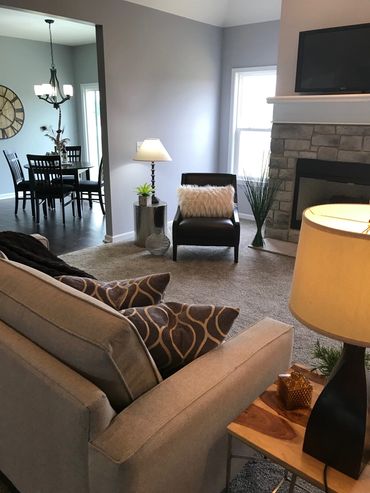
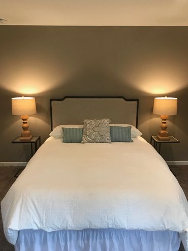
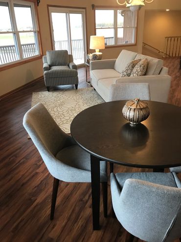
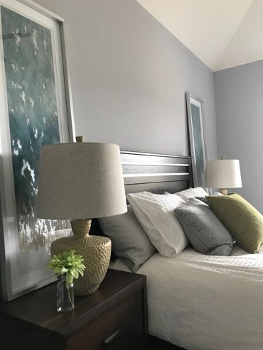
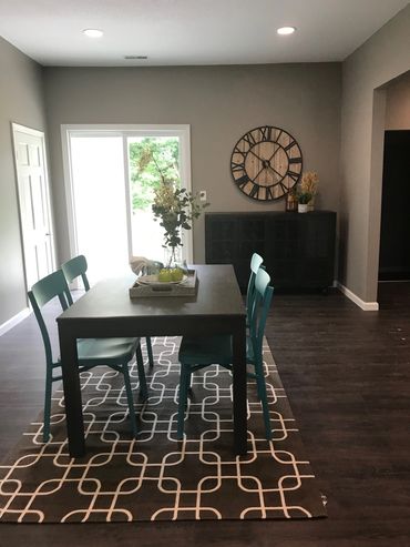
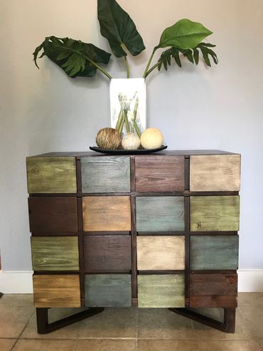
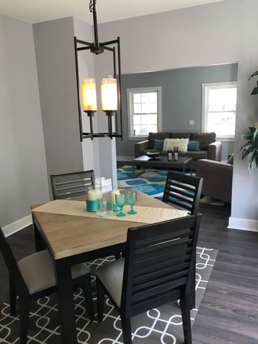
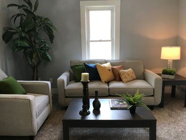
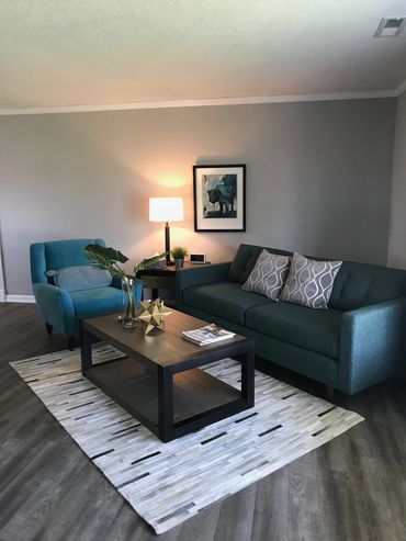
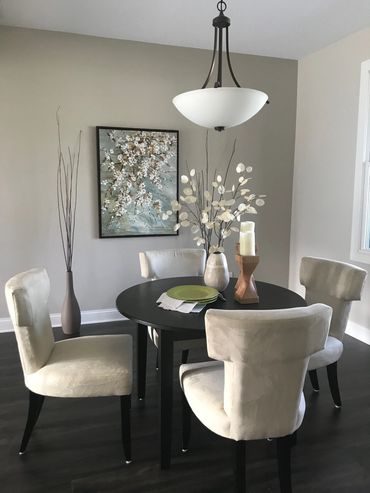
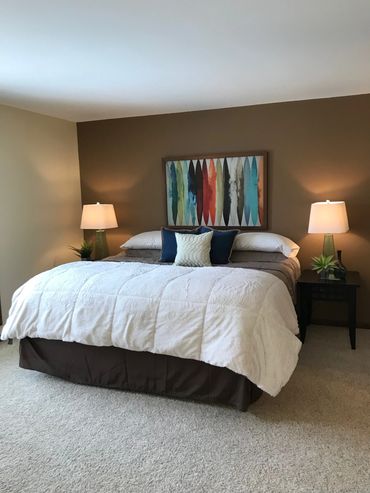
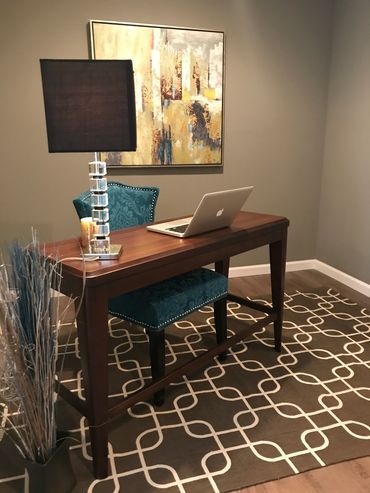
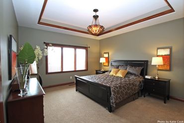
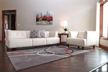
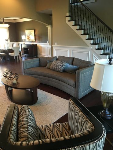
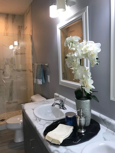
.jpg/:/cr=t:0%25,l:0%25,w:100%25,h:100%25/rs=w:370,cg:true)
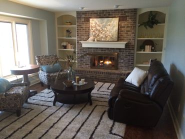
Photo Gallery - Residential Renewal / Renovation

Dated, choppy kitchen, and the eat-in kitchen/dining BEFORE.
This wall went away

BEFORE
Dark, dated, and choppy.
We had a great opportunity to open things up, and add to the space, the use, and the sun.

BEFORE

And, it begins....


And, the AFTER...
This client still raves about how much she LOVES her new kitchen!
Photo Gallery

This well-done, second kitchen had fun and bold colors, but was incomplete.
Photo Gallery

Photo Gallery

So, we gave it a bold "wow" factor!


This backsplash was created from a compilation of 12"x12" tile with a simple line design.


Photo Gallery - Commercial Renewal

The oldest restaurant in the city was ready to come into the current century.

BEFORE
After 30 years of no updates, this icon of the city needed a fresh face.

BEFORE
The clutter and sponge painting were ready to go.

BEFORE
This beautiful cabinet had become a catch-all

AFTER

AFTER
The beautiful cabinet now houses wine.
Hello
more to come...
So many photos!
We're selecting our favorites to add.
We hope you enjoy our site and take a moment to drop us a line.
